Slacker Radio
Information
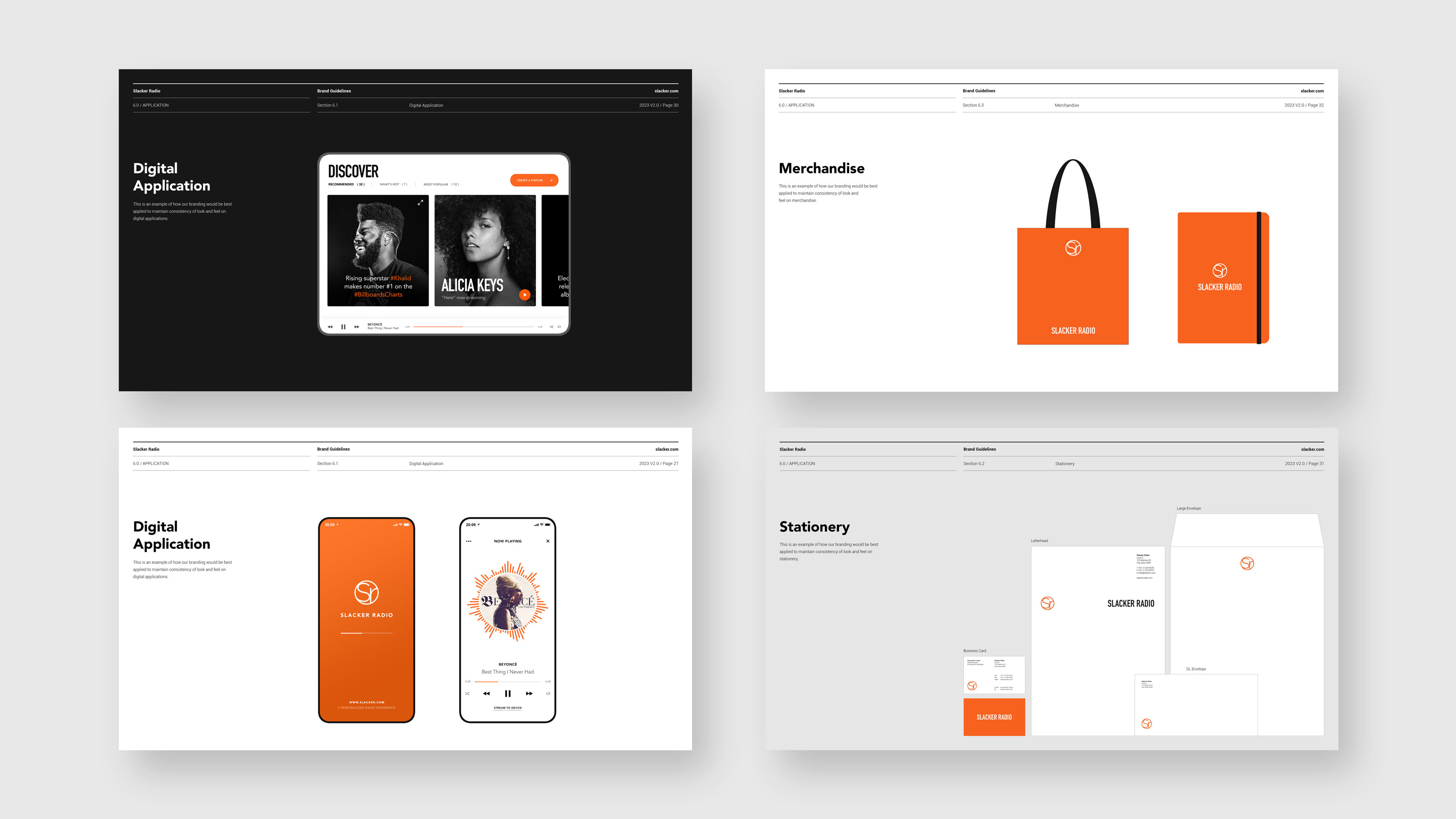
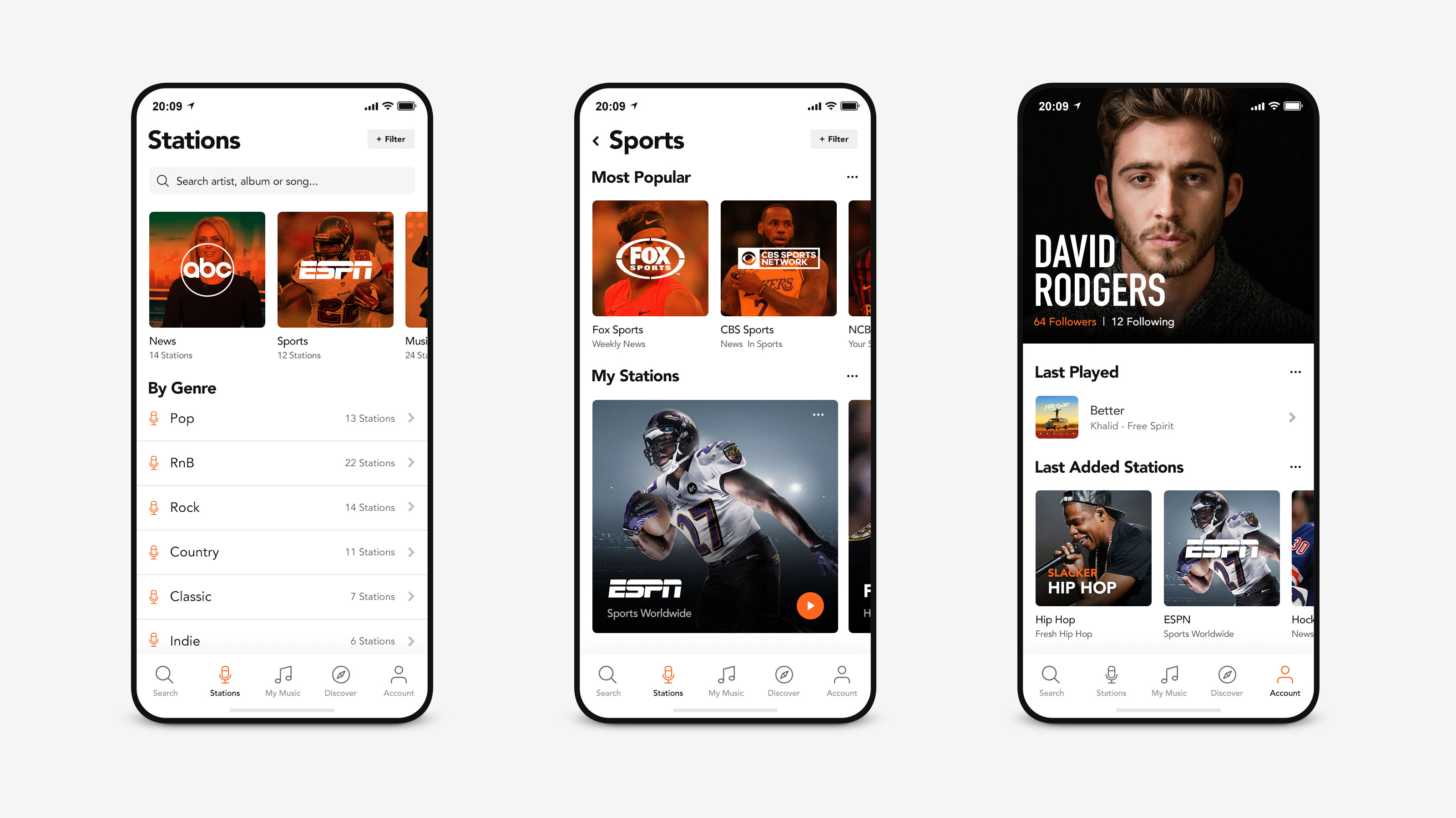
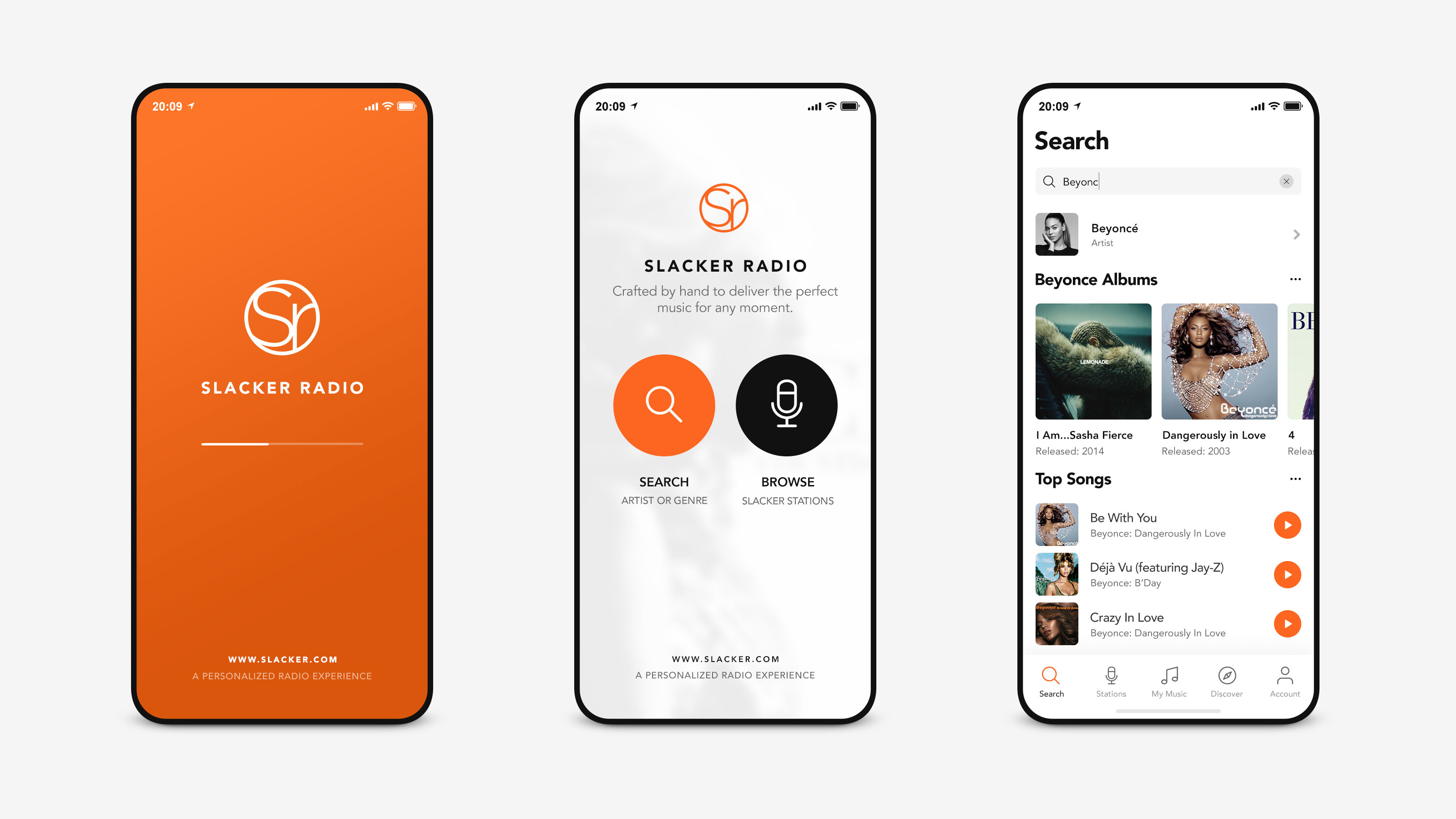
Slacker Radio approached me to explore a new take on their brand and the UI experience for their native apps. This is a selection of some of the screens I designed as part of a massive digital experience. Bringing life, energy and a fresh look and feel to the mobile and tablet environment that is minimal, clean and precise – a mature application. Slacker Radio runs a combination of human-curated genre stations, algorithm-based customizable radio, and on-demand premium content. Slacker Radio mobile applications are available for Android, iOS, Windows Phone, and more.
Assignment
To design a fresh application experience with a high emphasis on user interactivity and visual content in a functional yet innovative design while also introducing new functionally.
Objective
To launch a new version of the app that gives users a much better interactive experience with a more visual and innovative approach to their media library and stations.
Project Includes
Concept Design
Final Design
Design Prototype
Design Presentation
Year
2014
2017
Music on demand, simplified
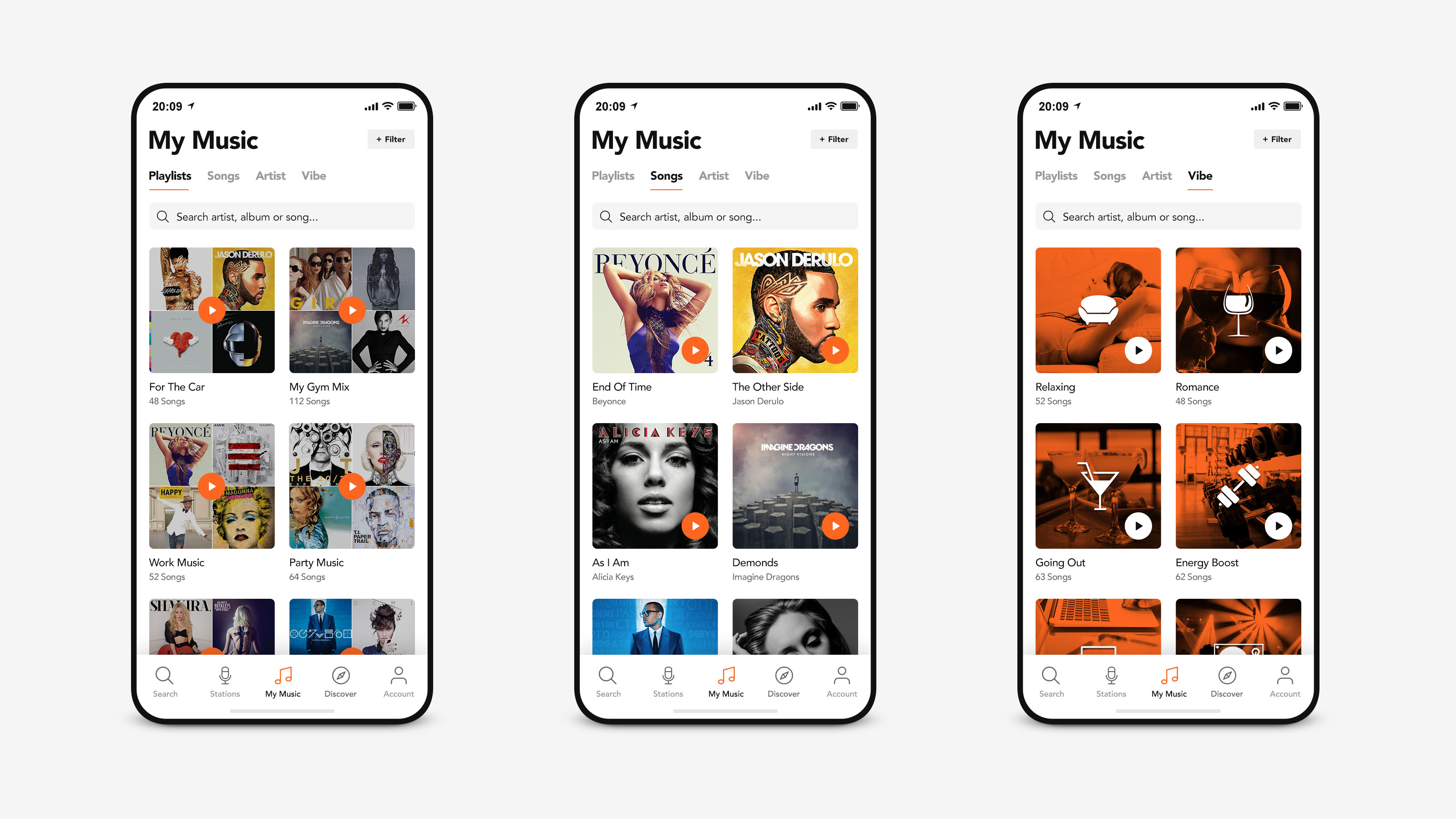
Slacker Radio wanted to give the audience an opportunity to experience their library in 4 ways at the time: Playlists, Songs, Artists and Vibe. The first section of the “My Music” part of the app already existed within the app but needed a complete refresh to how the content was being displayed where the end result utilized cover artwork a lot more than previously. At the time, “The Vibe” was a new feature carried out by the app giving users the option to choose a mood-based station with hand picked songs within each category.
Stay up to date with artists and bands
Problem
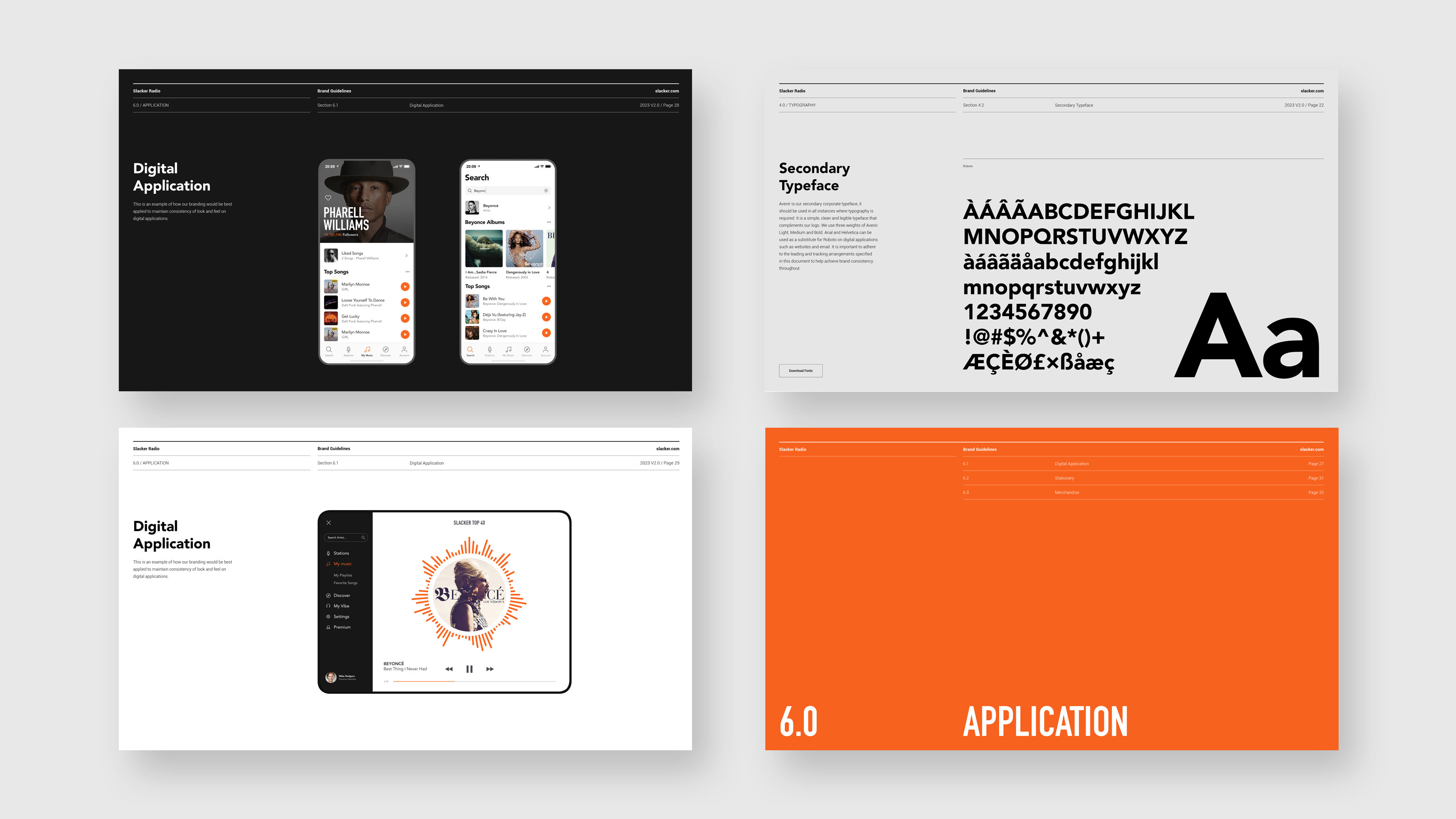
At the time, Slacker provided pre-made stations to tune in to but there was no way of getting any more information about an artist group or any other channel without leaving the app. Slacker wanted their users to have access to additional content within the app.Design Solution
A complete discography / trend page for each artist or group was designed. Each artist page was designed to feature everything the app had to offer about the artist, such as: songs, playlists etc while also showing trending behavior from within the app itself.